9 Reasons Why Your Instagram Reels Are Not Getting Views (And How to Fix Them) 9 possible reasons why your Instagram reels are not getting views Instagram Reels has become a powerful tool for creators...

Top Benefits of Hiring the Best Digital Marketing Agency in Kolkata In today’s competitive market, hiring a top digital marketing agency in Kolkata is essential. Businesses, big or small, can thrive...
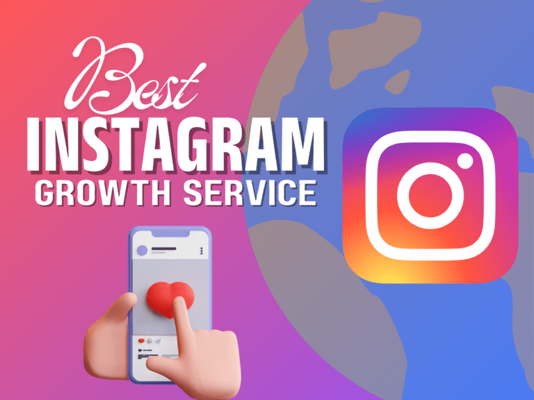
Instagram Marketing Services At Social Media Web Solutions, we specialize in offering top-notch Instagram marketing services that are designed to help you grow your account with guaranteed results. As...
Instagram Services At Social Media Web Solutions, a trusted digital marketing agency in Kolkata, we specialize in offering top-tier Instagram marketing services to help you elevate your brand’s...

How to Get Instagram Followers for Free Tips, Risks, and Real Alternatives for Genuine Growth Growing an Instagram following can be exciting, but also challenging, especially if you’re looking to do...

Facebook Cover Photo Size Explained The Facebook cover photo is the first thing people see when they visit your profile or business page, making it crucial to understand its dimensions. Proper sizing...
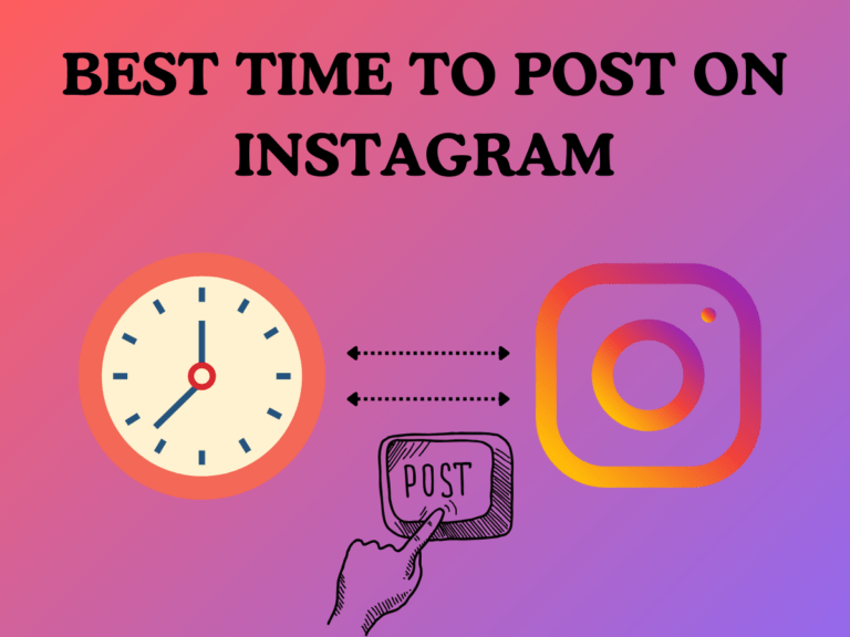
best time to post on Instagram The best time to post on Instagram depends on various factors, including your audience, industry, and location. Here’s a detailed breakdown on the best times to post...

Best and creative Instagram story ideas Instagram Stories have transformed the way individuals and brands engage with their audience. With more than 500 million users posting daily, it’s crucial...
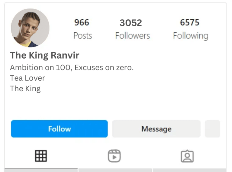
Best Instagram bio for boys and girls Here are some Instagram bio ideas for various topics, including boys, girls, stylish, funny, and more: 1. Instagram Bio for Boys Success is my only option 🏆 Built...

Best caption for Instagram The best caption for Instagram is one that resonates with your audience, complements your image or video, and encourages engagement. It should be concise, authentic, and...